The Withings app hasn’t changed much since it was first released in 2009. The main addition since then has been the introduction of blood pressure data that accompanied the release of the blood pressure monitor, but otherwise we hardly touched the other aspects and after three years we felt the need to make a great overhaul of the application. We wanted not only to take advantage of the various feedbacks we received over the years, but also to introduce many new features that we hope you will enjoy.
We firmly believe that connected devices that enable and facilitate self-tracking can be a key to a healthier lifestyle. Our goal with this new version of the Withings app is to take it to the next level and make it the best portal available to check and analyze your body measurements and plan how you want to act with regards to those readings. In this post, we give you a glimpse into the future of the Withings app.
A brand new user interface
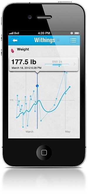
The first major change that we are introducing is in the look and feel of the app. As you can see in the image below, we opted for a smoother style, with lighter and more vivid colors. Like before, you will be able to zoom in or out on your graph at will to see the finer details of the evolution of your curves.

Many new features
Beyond the aesthetic aspect, we are also introducing brand new ways for you to visualize and analyze your data. Innovative tools will enable you to get a full picture of your overall health with just a glance.
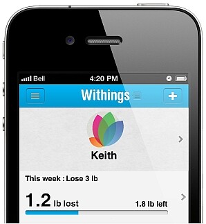
In the same spirit of making the app even more useful, we have increased the focus on goals and objectives. You will have new dedicated tools at your disposal to help you set your objectives and reach them. Among other things, and to fill requests we have received, you will be able to add a comment to any data point and we have also made it much easier to manually add a new entry.

This post is just a first quick look at this new app, many other innovations and new features await you. Our goal with this new version is to make it even more useful, to enable you to better analyze and exploit your personal data while keeping it easy to use and nice to look at – two aspects we consider very important.
We expect the new app to come out in June, it will be released first on iPhone and iPad and then later on Android. Stay tuned for more news about this new Withings app!
Beyond the aesthetic aspect, we are also introducing brand new ways for you to visualize and analyze your data. Innovative tools will enable you to get a full picture of your overall health with just a glance.
In the same spirit of making the app even more useful, we have increased the focus on goals and objectives. You will have new dedicated tools at your disposal to help you set your objectives and reach them. Among other things, and to fill requests we have received, you will be able to add a comment to any data point and we have also made it much easier to manually add a new entry.


