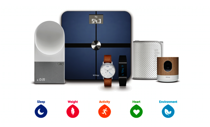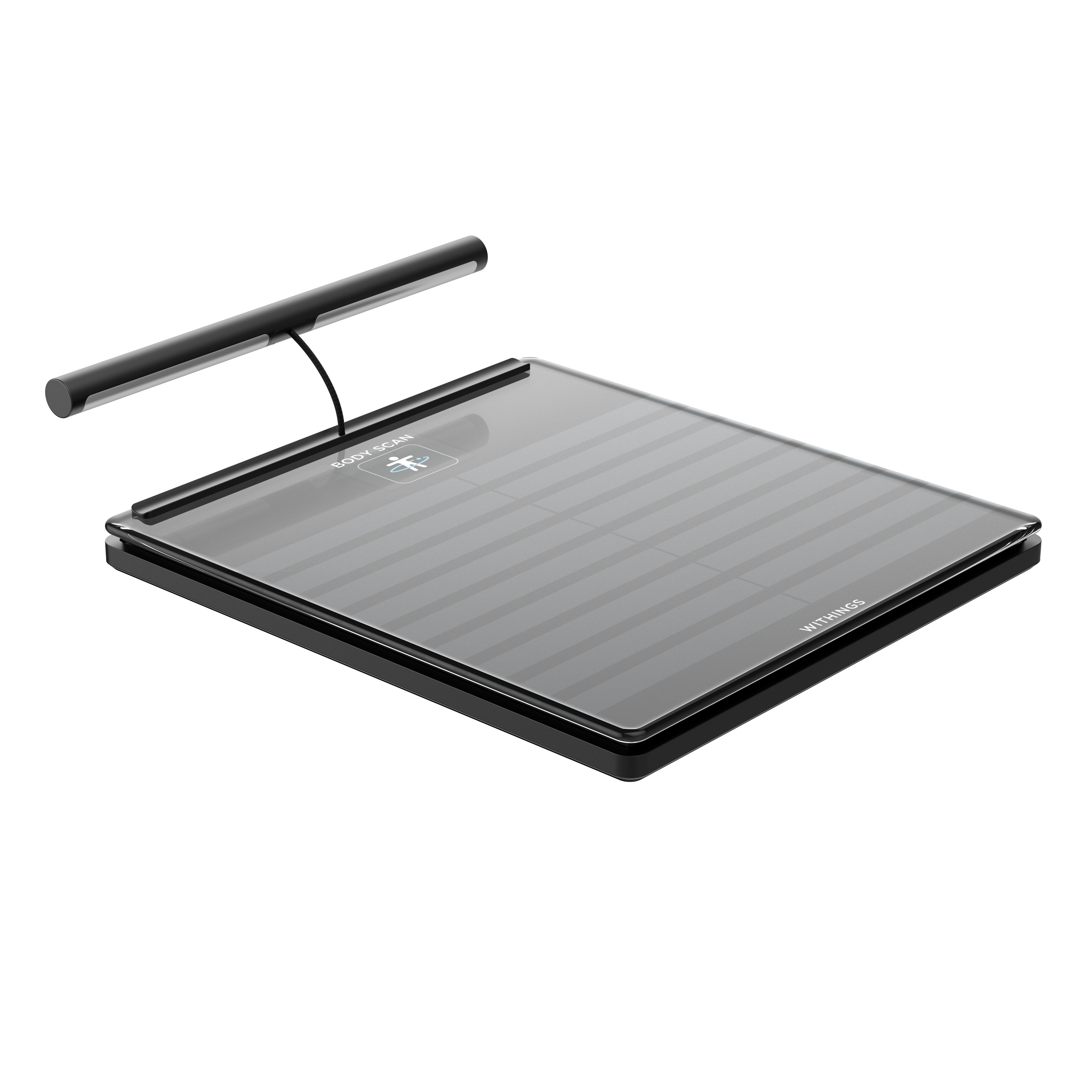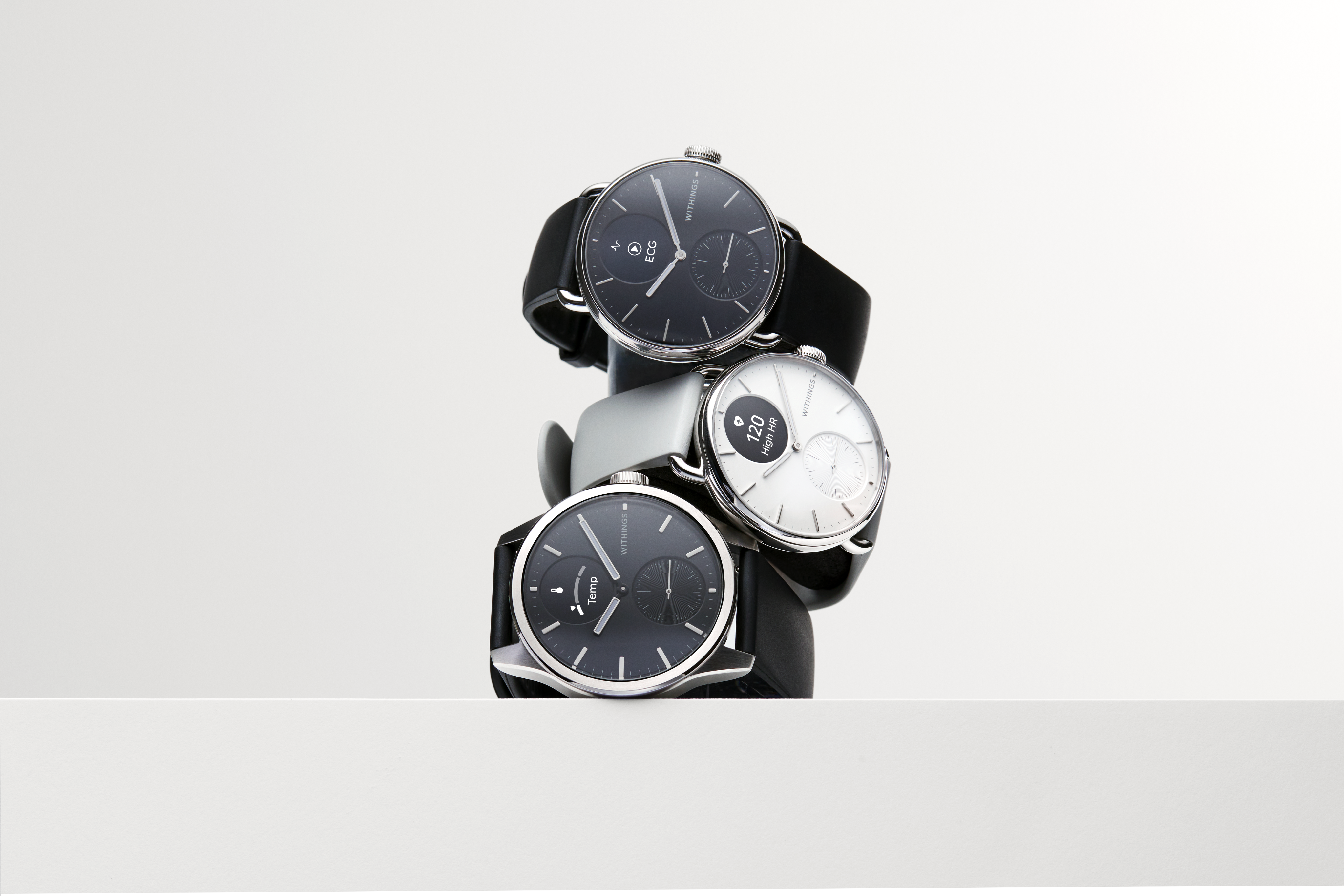
As we are launching Withings Home, a device that tackles a new health dimension and will focus on your home environment, we thought it was the right time to unveil our new identity. Our products continue to evolve and our image must reflect our growth. We are proud to have built a broad health ecosystem to give you the most of the connected-health revolution.
The new Withings logo is symbolic of our 360° range of devices, and represents the simplicity and values we keep in mind each time we design a product.
We created this symbol to portray the elements we at Withings believe are most essential for a healthy life. It is an iconic mark for our ecosystem, made of 5 health dimensions: heart, weight, sleep, activity and environment. These dimensions have been shaped with a pointed edge to represent the interconnectedness of our products, striving to provide our users with a full 360° health experience.
The progression of the dots conveys the message that our products allow consumers to track what matters in order to improve their everyday wellbeing, by making small but impactful decisions. Finally, the logo represents the W of Withings.
Each health dimension will be customized to have a logo with its own color, so that you will know which aspect of your health you are shaping and taking care of.

Starting today, you will see the new Withings’ logo everywhere, supporting our products and our brand occurrences. We are excited to share this new identity with you as we continue to inspire health.


